

Designing a responsive website for a museum of modern art
Project Overview
Lumina is a modern art museum website concept designed to provide an intuitive digital experience, offering clear navigation, easy access to exhibitions and events, and a simplified booking process for museum visitors.
My Role
UX design generalist
Project Duration
10 weeks
Responsibilities
The Problem
Many museum websites are outdated, cluttered, and not optimized for mobile users. Visitors often struggle to find essential information such as exhibition details, opening hours, and ticket booking options.
• Conducted user research to understand visitors’ needs and pain points.
• Created user flows, wireframes, and prototypes for the website.
• Designed intuitive, responsive, and visually appealing interfaces.
• Tested designs with users and refined based on feedback.
The Goal
Design a responsive and intuitive museum website that allows users to easily explore exhibitions, learn about upcoming events, access visitor information, and book their museum visits. The design needs to adapt smoothly across mobile, tablet, and desktop screens.
User Research
For this project, I conducted 5 user interviews to understand how people interact with museum websites. I also reviewed several existing museum websites to identify common usability issues. Initially, I assumed that users mainly visited museum websites for visual inspiration and general information. However, the research revealed that users were highly task oriented and wanted fast and easy access to essential information such as exhibitions, opening hours, events, and ticket booking especially on mobile devices.
Pain Points
Unclear Navigation
Users found it difficult to locate key information like exhibition details, ticket prices, and opening hours because of cluttered menus and inconsistent layouts.
Poor Mobile Experience
Many museum websites were not responsive, making it hard to scroll, tap, and read content on smaller screens like mobile.
Complicated Booking Process
The ticket or booking pages often required too many steps, leading users to abandon the process halfway.
Overloaded or outdated design
Users expected an art museum’s website to reflect creativity and beauty. Instead, many found old-fashioned layouts, low-quality images, or too much text.
Understanding the User
User Persona
Andy Williams
42
Bachelor’s degree
California, Los Angeles
single
Marketing Specialist
Age:
Education:
Hometown:
Family:
Occupation:
Goals
• Quickly find current and upcoming exhibitions
• Easily check opening hours and ticket prices
• Book tickets online with minimal steps
• Have a smooth experience on mobile while on the go
• Feel inspired by a modern, visually appealing museum website
• Confusing navigation and cluttered menus
• Websites that are not mobile-friendly
• Too many steps or forms in the ticket booking process
• Outdated design that doesn’t reflect the creativity of modern art
• Difficulty finding essential information quickly
Frustrations
“
I just want to book my ticket quickly and know what exhibitions are on without digging through the website.
”
Andy is a busy, tech savvy professional who often visits museum websites on his phone. He values speed, clarity, and trustworthiness over excessive content. If he can’t find key information or book tickets easily, he will leave the site and look for alternatives. A clean design, intuitive navigation, and a seamless mobile-first experience are essential to meeting his needs.


User Story
As a busy museum visitor, I want a clear and mobile-friendly website where I can quickly find exhibitions and book tickets so that I can plan my visit efficiently without frustration.
User Journey

Problem Statement
Andy is a busy museum visitor who needs a mobile-friendly website to quickly find and book exhibitions and events, because he has limited time and navigating cluttered or outdated museum websites is frustrating.
Design Direction
Hypothesis Statement
If Andy uses a responsive museum website that has clear navigation and shows upcoming exhibitions and events, he will be able to quickly access essential information, book tickets efficiently, and have a more enjoyable and stress-free experience.
Goal Statement
Our platform will let visitors quickly discover and book exhibitions and events through a responsive website with clear and easy navigation, featuring upcoming exhibitions, events, and featured artworks, as well as accessible information about current and past exhibitions. This will help busy visitors like Andy save time and have a stress-free, enjoyable, and dependable experience. We will measure effectiveness by tracking website engagement, completed ticket bookings, and repeat visits or interactions with exhibitions.
Competitive Audit

Define the Experience
User Flow
Visitor


Site Map

Design Execution
Paper Wireframes
Through multiple iterations of the Homepage wireframes, I selected the best design elements from each version and combined them into a refined design.
Stars were used to mark the elements of each sketch that would be use in the initial digital wireframes.
Homepage


Based on the final homepage design, I created responsive wireframes for mobile and tablet to ensure the experience remains clear, usable, and consistent across different screen sizes.


Mobile View
Tablet View
Responsive Adaptation
Digital Wireframes
Throughout the wireframing phase, I aligned design decisions with insights from user research.
Homepage
Clear Prioritization of Content
Upcoming exhibitions and events are immediately visible, helping users quickly find find what interests them

Featured Artwork Section
Highlights one artwork per month, giving users a visually engaging entry point and encouraging exploration, addressing users’ desire for inspiration and clarity in content
Exhibitions Page
Events Page
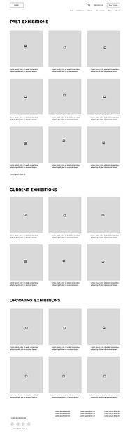
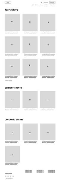
Vertical Layout
The Exhibitions and Events pages feature a vertical layout, displaying current, upcoming, and past items in one continuous scroll. This layout ensures a clear overview and simple, intuitive access to all exhibitions and events
Low-Fidelity Prototype

This Low-Fidelity Prototype demonstrates the main user flows across the website. users can start from the Home page and navigate to browse exhibitions, explore events, and purchase tickets.
Exhibitions Page

Tickets Page

Homepage

Events Page
Usability Study
I conducted an unmoderated remote usability study with five participants representing typical museum visitors. Sessions followed a scenario-based, think-aloud approach in which participants described how they would complete tasks using the Figma prototype (no actual data entry required).The study began with a low-fidelity prototype, followed by a high fidelity prototype after iteration. Each session lasted 25–30 minutes, including introduction, tasks, and a closing questionnaire.
Study Goals
The study aimed to evaluate how easily and intuitively users could navigate the website, focusing on:
• Exploring Exhibitions: Finding current, upcoming, and past exhibitions, understanding the layout, and accessing exhibition details.
• Booking Tickets: Completing the ticket purchase process smoothly.
Affinity Diagram
Insights from usability testing were grouped into themes using an affinity diagram to identify recurring usability issues and opportunities for improvement.

Low-Fidelity Findings
Forced Login during ticket checkout created friction
During ticket booking, users were required to login or create an account before proceeding to checkout. Several participants expressed frustration, stating they wanted the option to continue without becoming a member.
Scrolling made content harder to discover
Users found it inconvenient to scroll through the exhibition page to locate current, upcoming, or past exhibitions and they wanted faster access to relevant information.
High-Fidelity Findings
Missing “Back to Home” Navigation on Payment Page
Once users reached the payment page, the “Back to Home” option was no longer available, limiting their ability to easily exit or restart the process.
These findings come after iteration on the low-fidelity prototype and testing a high-fidelity prototype.
Ticket Selection Uncertainty
After selecting a ticket type, users were taken directly to the payment page without seeing a confirmation of their selected ticket details. Users felt uncertain about whether they had selected the correct ticket.
Design Iterations
Low-Fidelity Iterations
• Based on the finding that forcing login, I added a Guest Checkout option, allowing visitors to complete their ticket purchase without becoming a member. This change reduces barriers, speeds up the checkout process, and supports a smoother, experience for first-time and busy visitors.

Before Usability study

After Usability study
• Based on the finding that "scrolling made content harder to discover", I refined the design by adding a navigation bar that allows users to switch between Current, Upcoming, and Past Exhibitions and Events. This improvement reduces excessive scrolling and gives users faster, more direct access to the category they are looking for, creating a clearer and more efficient browsing experience.

Before Usability study

After Usability study
High-Fidelity Iterations
• Based on the finding that back-to-home navigation was missing, I refined the design by adding a clickable museum logo to the top of the payment page, allowing users to return to the homepage at any point during checkout. I also improved text colors and contrast in several areas to improve accessibility and readability, aligning with WCAG guidelines.

Before Usability study

After Usability study
• Based on the finding that ticket selection lacked confirmation, I added a purchase summary step before the payment page, allowing users to review ticket type, date, quantity, and total cost before proceeding.

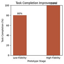
Usability Testing Results (Exploratory)
Based on usability testing with 5 participants, task completion increased by 20%, improving from 80% (4/5 users) in the low-fidelity prototype to 100% (5/5 users) in the high-fidelity iteration.
Design System
Color Palette
The color palette follows 60-30-10 rule,using soft neutrals to create a calm and refined atmosphere, while a warm orange accent highlights key actions and enhances visual clarity without overwhelming the interface.
Hex #FFFFFF
Hex #FF8C00
Hex #FFF0E0
Typography

Hex #FFD6A8
Hex #D9D9D9
Hex #5D5555
Hex #C65102
Buttons
Primary
Secondary
24 PX
24 PX

15 PX
17 PX
Final Design
high-fidelity mockups & interactions


Exhibitions Browsing Flow

Visitor information (opening hours, location, and other key details) is accessible via the homepage footer and navigation bar, allowing users to plan visits while browsing exhibitions.


1
2
3
4
Ticket Purchase Flow


1
2
3
4

5

6
Responsive Adaptation
While only the homepage is shown here, the principles of responsive design were applied across the site to ensure layout, readability, and navigation consistency on tablet and mobile devices. The tablet version maintains the same content and hierarchy as the desktop, with slight adjustments in spacing and image sizes.

Tablet View

Mobile View


Accessibility Considerations
Clear Visual Hierarchy & Readable Typography
I used clear visual hierarchy, consistent spacing, and readable font sizes to help users quickly scan content and understand key actions. Headings, labels, and form fields are visually distinct, reducing cognitive load and making the interface easier to navigate for all users.
Large Tap Targets & Simple Interactions (WCAG Operable)
Buttons and interactive elements were designed with large clickable areas and sufficient spacing to support users with limited motor control. Flows are simple and linear, minimizing unnecessary steps.
Color Contrast (WCAG Perceivable)
I ensured sufficient color contrast between text, icons, and background elements so content remains readable for users with low vision or color vision deficiencies.
Takeaways
Impact
This design helps museum visitors feel confident and informed when planning their visit by offering an intuitive and responsive experience across devices. Users can easily explore current exhibitions, learn about upcoming events, access essential visitor information, and book tickets through a clear and structured flow. The responsive layout ensures a smooth experience across mobile, tablet, and desktop, allowing visitors to engage with the museum in a way that fits their needs and context. During peer review, one participant shared, “Everything felt clear and easy to navigate.”
Through this project, I learned the importance of clarity, responsiveness, and usability in digital museum experiences. Clear navigation, consistent layouts, and well-defined checkout steps help users feel confident and reduce friction, especially when moving between devices. This project reinforced how usability testing can uncover small but impactful issues, such as missing confirmation steps that once resolved, significantly improve clarity and trust in the overall experience.
What I learned
Next Steps
Future Enhancements
Enhance Responsive Design
I plan to focus on improving responsiveness and accessibility across devices to ensure a smooth and inclusive experience for all visitors.
Add Visitor Engagement Features
I’d like to investigate adding features such as personalized exhibition recommendations or event highlights to encourage more frequent and meaningful interactions with the museum.
A/B Testing Ticket & Exhibition Flow
I would like to conduct A/B testing on the ticket booking and exhibition flow with a larger group of participants to validate usability patterns and ensure a smooth, enjoyable experience.
© 2026. All rights reserved to Atousa Ghafoori